Media Query in CSS


Media query allows to apply styling based on general device type(like mobile, laptop, computers) or based on screen resolution or viewport width
general syntax
@media [all,not,only] [mediatype] logicaloperator(and,not,or) [media feature expression]
{
    your CSS code here
}
Media type
screen
media query is applied mainly for devices like mobile, laptops, computers and tablets
@media screen{
    h1{
        background-color: yellow;
    }
}
heading background color will be changed to yellow when opened on screen devices
Media query is applied when page print preview or printer-like devices
similarly, we can apply media queries for screen reader devices as speech and all which applied to anything
@media print{
    h1{
        background-color: yellow;
    }
}
Logical operators
AND
Media query applied when all conditions are TRUE
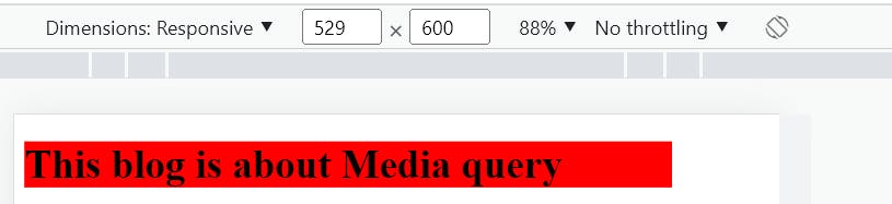
@media screen and (orientation:portrait){
    h1{
        background-color: red;
    }
}
in this case, the background color red is applied only when the screen is in portrait and the device is on screen
OR
CSS styling is applicable when anyone of condition is TRUE among the media feature expression
multiple conditions can be injected using comma(,)
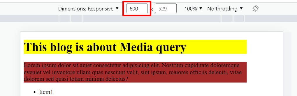
@media screen and (max-width:600px), screen and (orientation:potrait){
    p{
        background-color: brown;
    }

}
This is not in portrait but width is 600px
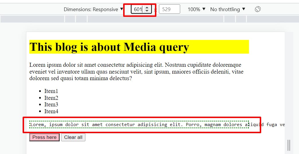
NOT
conditions are applied but in reverse meaning
@media not (max-width:600px){
    span>pre{
       border: 3px dotted green;
    }

}
The border will be created around pre-element only when the minimum width is 600px
CSS breakpoints
Based on device
With rapidly changing technology, there are so many devices coming out with different screen sizes and it is not feasible for developers to target every screen size, to cover all aspects CSS breakpoints is much needed
@media only screen and (max-width:600px){
    input[type="button"]{
        background-color: aqua;
    }
}

@media only screen and (min-width:600px){
    input[type="button"]{
        background-color: pink;
    }
}

@media only screen and (min-width:768px){
    input[type="button"]{
        background-color: violet;
    }
}

@media only screen and (min-width:992px){
    input[type="button"]{
        background-color: blue;
    }
}
when the width is 0-600px:

Width 601-767px:
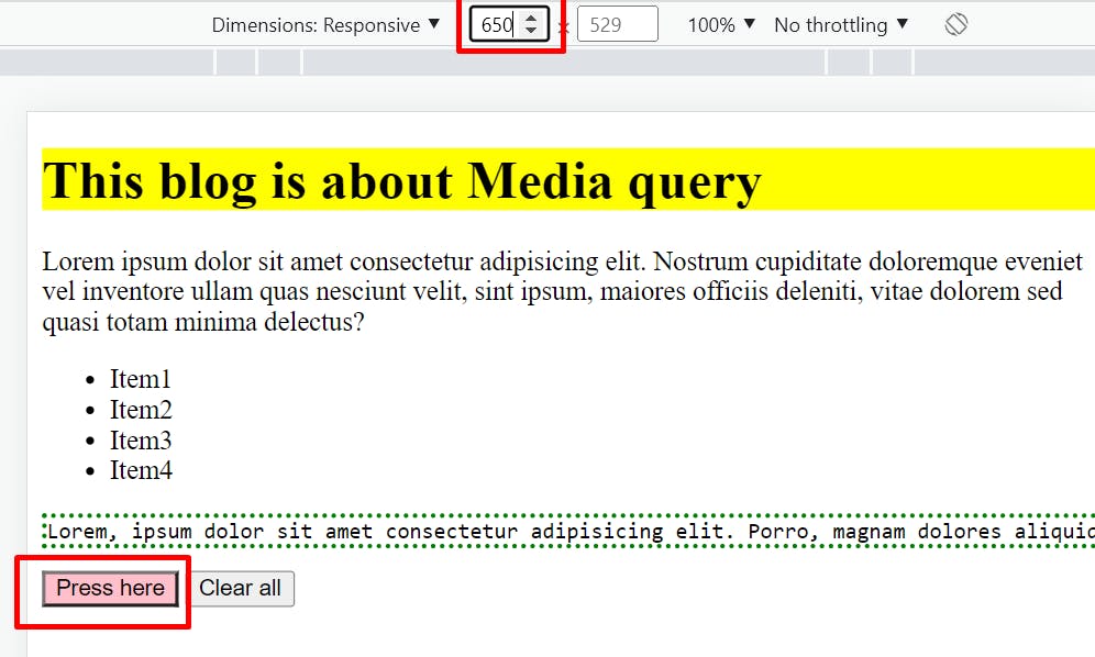
Width 769-991px:

and so on