Grid in CSS


Introduction
Gris is a two-dimensional layout design that makes web pages easier with help of rows and columns
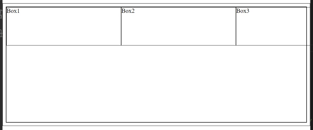
To create a grid we must use the display property: grid like below.
.grid{
    display: grid;
}
you may not see the effect immediately, let us learn how to make it work
Grid lines
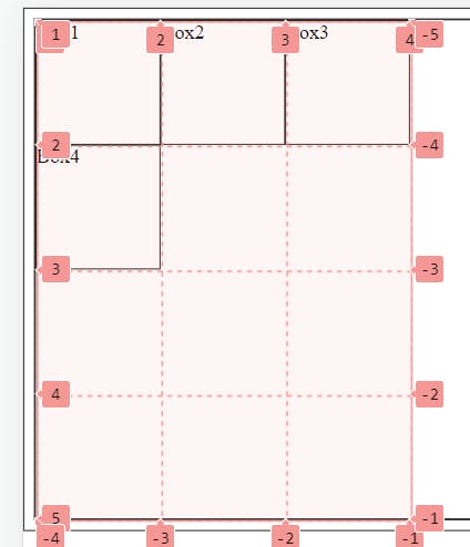
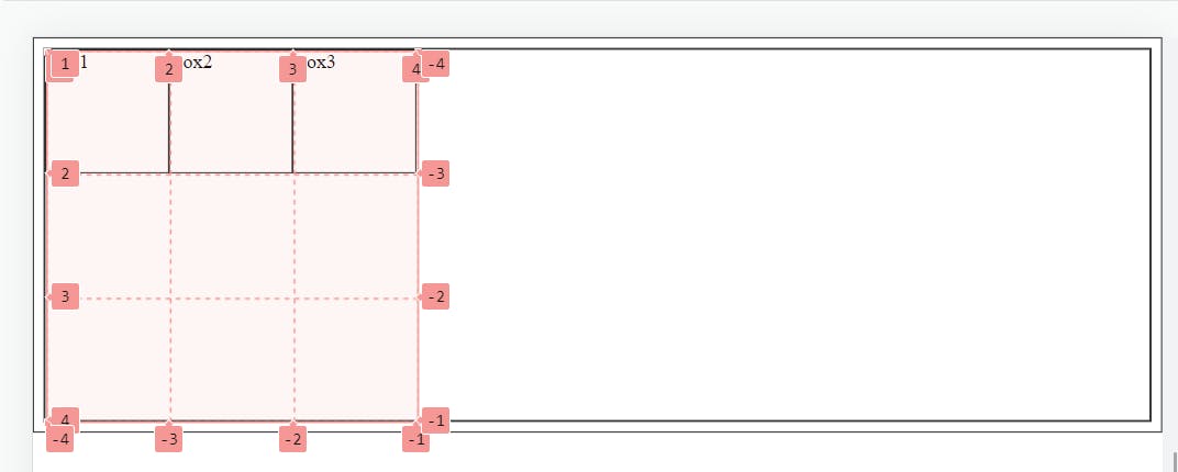
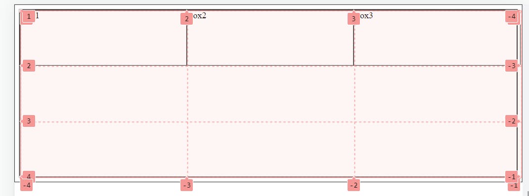
grid lines are vertical and horizontal lines running through the entire CSS grid, imagine a table
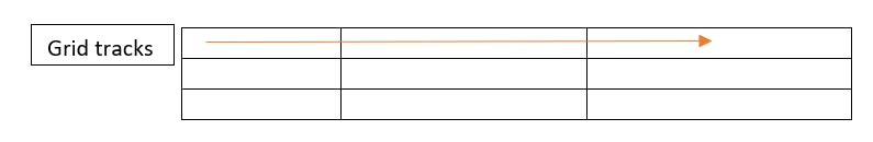
Grid tracks
Space between two consecutive lines is called grid tracks, it can either row or column
Grid cells
space between four consecutive lines is called grid cells, similar to the table every table cell is similar to a grid cell

Grid areas
It is a collection of grid cells
Grid columns
space between two adjacent vertical lines are columns
Grid rows
space between two adjacent motivational lines are rows
Gutter
The gap between two adjacent rows or columns is gutters
Ways to create rows and columns
we can use property
grid-template-rows: X X X X -> 'X' defines the of rows in the grid container
grid-template-column: Y Y Y Y ->' Y' defines the no of columns in the container
.grid{
    display: grid;
    grid-template-columns: 100px 100px 100px;
    grid-template-rows: 100px 100px 100px ;
}
Repeat()
A shorthand way to define rows or columns size and no of items can be achieved using the repeat(x,y) method -> first parameter(x) is for how much time items should repeat and the second parameter(y) is for the size of a cell
.grid{
    display: grid;
    /* grid-template-columns: 100px 100px 100px;
    grid-template-rows: 100px 100px 100px ; */
    grid-template-rows: repeat(3,100px);
    grid-template-columns: repeat(3,300px);
}
minmax()
overlapping grid can be solved using minmax() in a parent container
minmax(min value, max value) -> this will create a cell with a minimum of min value and will increase according to content and not exceed the max value
.grid{
    display: grid;
    /* grid-template-columns: 100px 100px 100px;
    grid-template-rows: 100px 100px 100px ; */
    /* grid-template-rows: repeat(3,100px);
    grid-template-columns: repeat(3,300px); */
    grid-template-rows: repeat(3,100px);
    grid-template-columns: repeat(3,minmax(300px,400px));

}
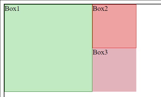
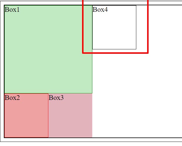
Positioning grid items
Individual items can be placed in different positions
grid-column-start and grid-column-end are the start and end positions of the item
grid-row-start and grid-row-end are positioned in horizontally for an item
.b1{
    border: 1px solid green;
    background-color: rgb(194, 234, 194);
    grid-column-start: 1;
    grid-column-end: 3;
    grid-row-start: 1;
    grid-row-end: 3;
}
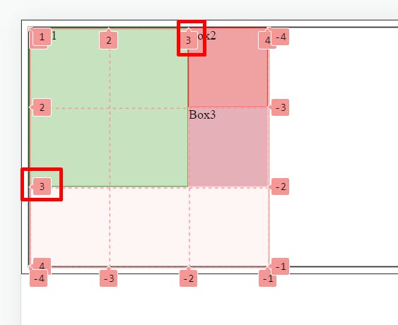
shorthand form for the same position is
.b1{
    border: 1px solid green;
    background-color: rgb(194, 234, 194);
    grid-row: 1/3;
    grid-column: 1/3;
}
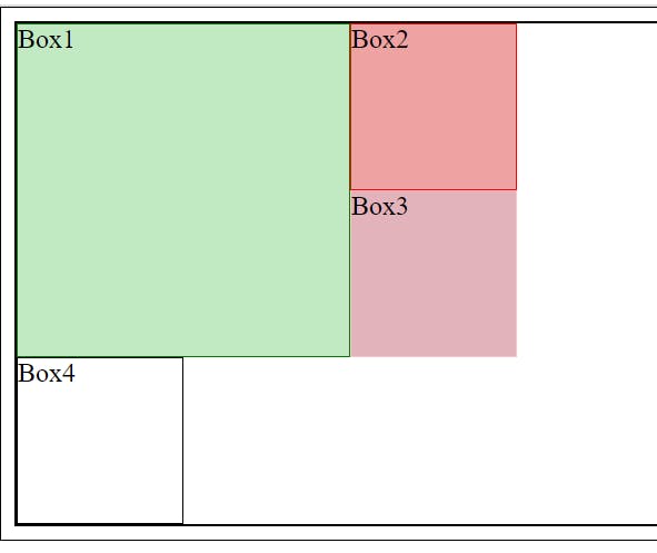
further, we can go for the shorthand method
.b1{
    border: 1px solid green;
    background-color: rgb(194, 234, 194);
    grid-area: 1/1/4/3;
}

Autoflow
When a new element is added, the item will be placed inside the grid in the row direction
after changing auto-flow to the column, the item will be directed to the column
.grid{
    display: grid;
    grid-template-columns: 100px 100px 100px;
    grid-template-rows: 100px 100px 100px ;
    grid-auto-flow: column;
}
all elements inside the container can be aligned in the x-axis using justify-content and the y-axis using align-content
.grid{
    display: grid;
    grid-template-columns: 100px 100px 100px;
    grid-template-rows: 100px 100px 100px ;
    grid-auto-flow: column;
    justify-content: center;
    align-content: end;
    height: 500px;
}